Structuring Responsive Layouts
This video tutorial focuses on creating a responsive web design layout using fluid grids and media queries. The instructor demonstrates how to set up the folder structure, link HTML and CSS documents, and build a basic layout structure using nested divs.
Lets Go!
Structuring Responsive Layouts
Lesson 21
Learn to structure responsive layouts using CSS grid or flexbox.
Get Started 🍁Introduction to Fluid Grid and Media Queries
Welcome to the course "Introduction to Fluid Grid and Media Queries"! In this course, we will delve into the world of responsive web design, specifically focusing on fluid grids and media queries.
But before we dive in, let's go over some key background information. The course builds upon the previous step of designing a prototype for a three-screen layout using a fluid grid. You should have created wireframes with layout divs and calculated percentages based on the 960 grid system.
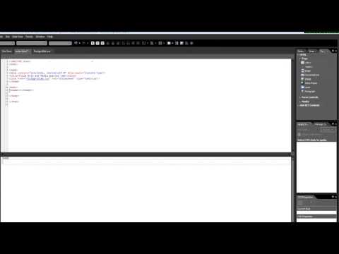
In this course, you will learn how to create a folder for your exercises, link media queries, set up HTML and CSS documents, and work with nested divs to build a responsive layout. We will also explore the use of media queries to apply different styling rules at different screen sizes.
Are you ready to explore the world of responsive design and create dynamic web layouts? Let's start by setting up our workspace and diving into the exciting world of fluid grids and media queries! What creative designs will you come up with? Join us to find out!
Main Concepts of Fluid Grids and Media Queries
-
Fluid Grids
- A fluid grid is a layout design technique in web development that uses relative units such as percentages to create a flexible and responsive design.
- The use of a fluid grid allows web pages to adapt and resize smoothly across different screen sizes, making them more user-friendly and accessible.
-
Media Queries
- Media queries are CSS rules that allow developers to apply different styles to a web page based on the device's characteristics, such as screen width, height, orientation, or resolution.
- By using media queries, developers can create responsive designs that adjust seamlessly to various devices, ensuring a consistent user experience across platforms.
-
Creating a Folder for Exercises
- Before starting the coding process, it's essential to organize files in a structured manner by creating a dedicated folder for the exercises.
- Naming the folder appropriately, such as "Fluid Grid and Media Queries," helps in maintaining a clear workspace and easy navigation of files.
-
Linking Files and Attaching CSS
- To link HTML and CSS files, developers can use the link tag in the HTML document to connect the styling information from the CSS file to the structure defined in the HTML file.
- Attaching a stylesheet to the HTML document ensures that the styling rules specified in the CSS file are applied correctly to the HTML elements.
-
Structuring the Document Object Model (DOM)
- Building a responsive layout involves defining a structured Document Object Model (DOM) that includes elements like wrapper, header, nav, main body, left, center, right divs, and footer.
- Using nested divs and HTML5 elements, developers can create a clear and organized structure for the webpage, ensuring readability and maintainability of the code.
-
Applying Media Queries for Responsive Design
- Incorporating media queries into the CSS file enables developers to set specific styling rules for different screen sizes and devices.
- By defining breakpoints within the media queries, developers can adjust the layout, font sizes, colors, and other design aspects to optimize the user experience on various devices.
Practical Applications of Fluid Grid and Media Queries:
Step-by-Step Guide:
-
Create a Folder for the Exercise:
- Create a folder named "Fluid Grid and Media Queries".
- Inside this folder, create an HTML document named "index.html" as well as a CSS document named "fluidGridLab.css".
-
Link CSS File to HTML Document:
- Open the HTML document in your editor.
- Use the toolbar to link the CSS file to the HTML document.
- Ensure the CSS file is attached to the current page only.
-
Structure Your HTML Document:
- Refer to your wireframes or mockups to understand the layout structure.
- Create div elements for the wrapper, header, nav, main body, left, center, right, and footer.
- Use IDs and classes to define these elements accurately.
-
Apply Styling with CSS:
- Open the CSS document in your editor.
- Write CSS rules to style each element (e.g., colors, fonts, margins, etc.).
- Use media queries to apply different styles based on screen size (e.g., for mobile, tablet, desktop).
-
Preview and Test Responsiveness:
- Save your files and open the "index.html" document in a browser.
- Test the responsiveness by resizing the browser window or using developer tools.
- Make adjustments to your CSS as needed to ensure the layout looks good on different screen sizes.
Ready to Dive In?
Follow the steps above to create a responsive layout using fluid grids and media queries. Don't hesitate to experiment and tweak the code to see how it affects the layout on different devices. Remember, practice makes perfect, so keep refining your skills by testing and iterating on your designs!
Test your Knowledge
What is the purpose of media queries?
Advanced Insights into Responsive Web Design
In this section, we will delve deeper into the topic of responsive web design and explore advanced aspects of creating fluid grids and media queries.
Tips for Success:
-
Folder Organization: When setting up your project folders, consider creating a separate folder for CSS documents. While it may be beneficial for this exercise to have everything in one place, maintaining a structured folder system is essential for larger projects.
-
CSS Linking: Ensure to link your CSS document to your HTML document correctly for the styles to be applied. Use tools within your development environment to easily attach stylesheets to your HTML files.
-
Nested Div Structures: Utilize nested div structures to create your layout. Remember that proper indentation in your code helps maintain clarity and readability, especially when dealing with multiple layers of elements.
Expert Advice:
-
Coding Tools: Take advantage of code editors like Dreamweaver, which provide assistance in writing clean and error-free code. These tools can help streamline the coding process and improve efficiency.
-
Responsive Design Strategy: By maintaining a consistent document object model (DOM) across different screen sizes, you can achieve responsive design without the need to alter content. Focus on adjusting styles using media queries for optimal display on various devices.
Curiosity Question:
How can you optimize media queries to apply different styling rules based on specific screen sizes or device orientations? Explore various breakpoints and design considerations to enhance the responsiveness of your web design projects.
Additional Resources for Responsive Web Design
For those interested in further exploring the topic of responsive web design covered in this video, here are some additional resources to enhance your understanding:
- Responsive Web Design Basics - A comprehensive guide on the basics of responsive web design.
- Media Queries for Responsive Design - Learn about how to use media queries to create responsive layouts.
- Responsive Web Design: What It Is and How To Use It - An article detailing the principles of responsive web design and how to implement it effectively.
- Introduction to Fluid Grid Layouts - Understand the concept of fluid grid layouts and how they can aid in responsive design.
By diving into these resources, you can deepen your knowledge of responsive web design and enhance your skills in creating engaging and user-friendly websites. Happy learning!
Practice
Task: Create a responsive layout for a webpage:
Include a header, main content area, and footer.
Use media queries to adjust the layout for screens smaller than 768px.