Basics of CSS Grid layout
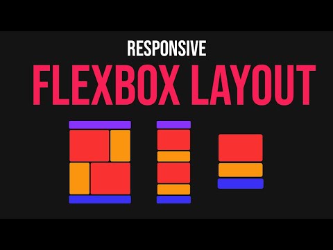
Learn how to create a responsive website layout using CSS flexbox. This tutorial will guide you through the process step by step.
Lets Go!
Basics of CSS Grid layout
Lesson 22
Understand the concept of CSS Grid and how to create a grid container and items.
Get Started 🍁Introduction to CSS Grid layout
Welcome to "Introduction to CSS Grid layout"! In this course, you will dive deep into the world of CSS Grid layout and learn how to create stunning layouts using CSS flexbox. Whether you are a beginner looking to understand the basics or an experienced developer seeking to enhance your skills, this course is designed to cater to individuals at all levels.
Have you ever wondered how websites achieve responsive designs like the one showcased in the video transcript? Join us as we explore the fundamentals of CSS Grid layout, from setting up containers and sections to styling elements with flexbox properties.
No prerequisites are required to enroll in this course, as we will start from the basics and gradually progress towards more advanced concepts. By the end of the course, you will not only have a solid understanding of CSS Grid layout but also the ability to create responsive layouts that adapt seamlessly to various screen sizes.
Get ready to unlock your creativity and enhance your web development skills with "Introduction to CSS Grid layout". Let's embark on this exciting journey together!
Main Concepts of Website Layout Using CSS Flexbox
-
Setting up the project
- Begin by creating an HTML file with a boilerplate, linking the stylesheet, and setting up the initial structure.
- In the CSS file, reset any default styles, such as padding, and set the box-sizing property to border-box.
-
Creating Containers
- Instead of one large container, divide the layout into two containers for better organization and understanding.
- Each container will hold specific sections of the website layout.
-
Styling the First Container
- The first container contains a header at the top and a section with two columns side by side.
- Use flexbox properties to make the columns equally sized initially, then adjust sizes as needed.
-
Adjusting Container Layout
- Change the flex-direction property to 'column' to stack the two boxes on top of each other.
- Adjust the size of each box within the section by assigning different fractional values with flex-grow.
-
Styling Sections
- Use flexbox properties to make the columns inside the section appear side by side.
- Adjust the sizes of the columns and add styling properties like borders and margins.
-
Creating the Second Container
- Copy the section structure from the first container to the second container, maintaining consistency in layout.
- Add any additional elements, such as a footer, in the second container.
-
Making the Layout Responsive
- Introduce breakpoints in the CSS code to control the layout behavior at different screen sizes.
- Adjust flex-direction and other properties to ensure the layout remains visually appealing and functional on various devices.
Practical Applications of Creating a Website Layout using CSS Flexbox
Step-by-Step Guide:
-
Set up the Project Structure:
- Begin by creating an HTML file with the necessary boilerplate code. Link the stylesheet and customize the title.
- Inside the CSS file, reset the image, set padding to zero, and define
box-sizing: border-box.
-
Create Containers for the Layout:
- Establish two main containers to hold different sections of the website layout for better organization and understanding.
- Designate a header box at the top and a section with columns side by side under it in the first container.
- Use flexbox properties like
display: flexto easily manage the layout structure.
-
Styling the First Container:
- Select the body and the container to set a minimum height and change the background color.
- Utilize flexbox by making the container a flex container and adjusting child elements with
flex: 1. - Arrange the two boxes inside the section to stack on top of each other, with flexible sizing.
-
Styling the Section Columns:
- Make the section a flex container and set the columns to
flex: 1each. - Adjust the layout to have the desired spacing between the columns and give them respective margin and border radius.
- Make the section a flex container and set the columns to
-
Creating the Second Container:
- Duplicate the section structure from the first container and add a footer below it in the second container.
- Modify the flex direction of the second section to differentiate it from the first container.
-
Adding Responsiveness:
- Introduce a breakpoint at a max-width of 968 pixels to switch the layout to a single column design.
- Adjust flex direction and margins to ensure proper stacking of sections when the viewport size is reduced.
Try It Out:
Follow the steps outlined above to create a simple and responsive website layout using CSS flexbox. Experiment with different properties and values to customize the design to your liking.
Test your Knowledge
Which CSS property is used to enable grid layout on a container?
Advanced Insights into Website Layout Design with CSS Flexbox
In this section, we will delve deeper into creating a website layout using CSS flexbox and explore advanced concepts to enhance your skills.
-
Utilizing Containers: Instead of just one container, consider using multiple containers to organize your layout effectively. By breaking down sections, such as headers and content, into separate containers, you can improve readability and maintain structure.
-
Optimizing Flexbox Properties: Understand the
flexproperty and how it distributes space among flex items. By settingflex: 1, you ensure that items share available space equally. Adjusting fractions allows you to control the size of individual items within a container. -
Advanced Styling Techniques: Experiment with border radius, background colors, and margins to add visual appeal to your layout. These CSS properties can enhance the overall design and make your website visually engaging.
-
Responsive Design Strategies: Implement media queries to create a responsive layout that adapts to different screen sizes. Changing the
flex-directionproperty based on viewport width ensures that your design remains functional and visually pleasing across devices.
Expert Tip: When designing a responsive layout, consider user experience on various devices. Test your website on different screens to ensure optimal display and functionality.
Curiosity Question: How can you further optimize your website layout for accessibility, considering factors such as color contrast and text legibility on different devices?
Additional Resources for Website Layout using CSS Flexbox
- CSS Flexbox Guide
- Responsive Web Design Basics
- Flexbox Froggy - An interactive game to learn Flexbox
- MDN Web Docs - Flexbox
Explore these resources to enhance your understanding of creating website layouts using CSS Flexbox.
Practice
Task: Create a simple 2x2 grid layout and place four colored boxes inside it.