Building responsive layouts with Flexbox
Learn how to create responsive layouts and solve common CSS problems by mastering CSS Flexbox and Grid. Understand how to align elements, wrap elements, resize elements, and utilize media queries for optimal layout design.
Lets Go!
Building responsive layouts with Flexbox
Lesson 21
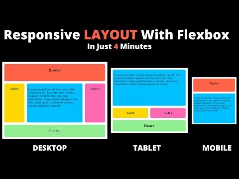
Use Flexbox to create layouts that adjust to different screen sizes and devices.
Get Started 🍁Introduction to CSS Flexbox and Grid Layouts
Welcome to the "Introduction to CSS Flexbox and Grid Layouts" course! Have you ever struggled with overflowing elements or weird resizing behavior in CSS, longing to create beautiful and responsive layouts effortlessly? If so, you're in the right place. In this course, we will delve into the fundamentals of CSS Flexbox and Grid layouts, essential tools for designing modern websites.
Understanding Flexbox will elevate your understanding of CSS, enabling you to create stunning layouts in various configurations with ease. We will cover the basics of defining a reference point in HTML, exploring how elements can be aligned within their parent containers in different ways. From horizontally centering a div to wider applications like responsive design, Flexbox is your key to mastering layout control.
As we progress through the course, we will delve deeper into key concepts such as positioning elements, wrapping content, resizing elements, and utilizing media queries. By combining Flexbox with Grid layouts, you can achieve complex designs and streamline your CSS code. We will explore real-world examples and projects to solidify your understanding and practical skills in creating modern web layouts efficiently.
Whether you are a beginner looking to enhance your understanding of CSS or an experienced developer seeking to simplify your code and explore advanced layout techniques, this course is designed for you. Join me, Fabian, as we embark on this coding journey and unlock the full potential of CSS Flexbox and Grid layouts. Let's dive in and uncover the secrets to building responsive and visually appealing websites!
Main Concepts of CSS Flexbox Course
- Understanding Flexbox will enhance your understanding of CSS and enable you to create beautiful and responsive layouts.
- Flexbox allows you to align elements within a parent container in various ways such as top, bottom, left, right, and center.
- It provides a solution for centering a div in HTML by addressing the parent element and using techniques like margin-right auto.
- Key takeaways of Flexbox:
- Position elements anywhere inside a flex container by considering the main and cross axis, justify content, and align items.
- Wrap elements to the next line using Flex wrap.
- Resize elements using Flex grow and flex shrink with different values for each element.
- Achieve layouts using minimum and maximum sizes and media queries.
- Introduction to CSS Grid:
- CSS Grid can simplify code and create more complex layouts with fewer lines.
- It offers an easier solution for centering a div compared to Flexbox.
- Practical learning through building advanced projects like the learning page using modern Flexbox and Grid sections.
Practical Applications of CSS Flexbox
Are you ready to dive into creating awesome responsive layouts with CSS Flexbox? Let's get started with some practical applications:
Step 1: Align Elements Inside a Parent Container
- Open your text editor and create a new HTML file.
- Define a reference point in your HTML file by using the `` tag or a specific container for your layout.
- Add HTML elements that will serve as flex containers or items within the container.
- Apply basic CSS styles to these elements.
- Use properties like
justify-contentandalign-itemsto align elements anywhere inside their parent container (top, bottom, left, right, center, etc.). - Experiment with different combinations to understand how flexbox works for element alignment.
Step 2: Center a Div in HTML Using Flexbox
- Create five
<div>container boxes in your HTML file. - Apply some basic CSS styles to these div boxes.
- Use the
display: flex;property along withjustify-contentandalign-itemsto center a div within its parent container. - Try centering the first element on the left side and the rest on the right side using
margin-right: auto;. - Practice using flexbox to achieve different alignment scenarios for your div elements.
Step 3: Understanding Key Takeaways of Flexbox
- Recap the main concepts of flexbox, including main and cross axes,
justify-content,align-items,flex-wrap,flex-grow, andflex-shrink. - Experiment with wrapping elements to the next line, resizing elements, and applying different values using flexbox properties.
- Combine flexbox techniques with minimum and maximum sizes and media queries to achieve various layouts efficiently.
Step 4: Simplifying Layouts with CSS Grid
- Explore the benefits of CSS Grid for creating more complex layouts or simplifying code.
- Compare using flexbox and grid for centering a div to understand the differences.
- Try using
display: grid;andplace-content: center;to center elements in a grid layout. - Experiment with building advanced projects that utilize both flexbox and grid for responsive layouts.
Get hands-on experience with CSS Flexbox and CSS Grid by practicing these steps in your own coding projects. Remember, the more you experiment and play around with these techniques, the more confident you'll become in creating stunning and responsive layouts.
Test your Knowledge
What does flex-wrap: wrap allow?
Advanced Insights into CSS Flexbox
Have you ever struggled with overflowing elements or weird resizing behavior in CSS and desired to create amazing responsive layouts effortlessly? Understanding CSS Flexbox is the key to unlocking a higher level of proficiency in CSS. It revolutionizes the way you approach coding and empowers you to craft beautiful and responsive layouts in various ways.
Tips and Recommendations:
- Define a reference point in HTML to start working with flexbox.
- Utilize the main and cross axes in flex containers to align elements.
- Use properties like justify-content and align-items for precise alignment.
- Wrap elements to the next line with flex-wrap or wrap.
- Resize elements dynamically using flex-grow and flex-shrink.
- Experiment with minimum and maximum sizes, along with media queries for adaptive layouts.
Expert Advice:
For more complex layouts or streamlined code, consider incorporating CSS Grid alongside flexbox. CSS Grid offers simplicity and efficiency in handling layouts with minimal code. By combining flexbox and CSS Grid effectively, you can achieve sophisticated designs with ease.
Curiosity Question:
How can you leverage CSS Grid and flexbox in tandem to create versatile and visually appealing layouts efficiently? Further exploration into advanced techniques can elevate your design skills and coding prowess.
Additional Resources for CSS Flexbox and Grid Layouts
If you're looking to further enhance your understanding of CSS flexbox and grid layouts, check out these additional resources:
-
Article: A Complete Guide to Flexbox - A comprehensive guide on mastering CSS flexbox properties and techniques.
-
Tutorial: CSS Grid Layout - Dive deeper into CSS grid layout with this tutorial from Mozilla Developer Network.
-
Course: HTML and CSS Complete Course - Explore advanced projects using modern flexbox and grid layouts to solidify your knowledge. (Note: The course mentioned in the video may be available through the first link in the video description.)
By exploring these resources, you'll be able to create beautiful and responsive layouts with ease.
Practice
Task: Build a responsive navbar that stacks vertically on small screens and aligns horizontally on larger screens using media queries with Flexbox.